Two Of A Kind —

Disrupting an Industry of Major Players by Creating Value for Consumers

Two of a Kind is a contact lens subscription-based start up offering competitive prices with the highest safety standards. Their business model disrupts the contact lens market that is currently being run by big players, by cutting out the middle man and focus on bringing the best quality, experience and value to the customers.

Objective —

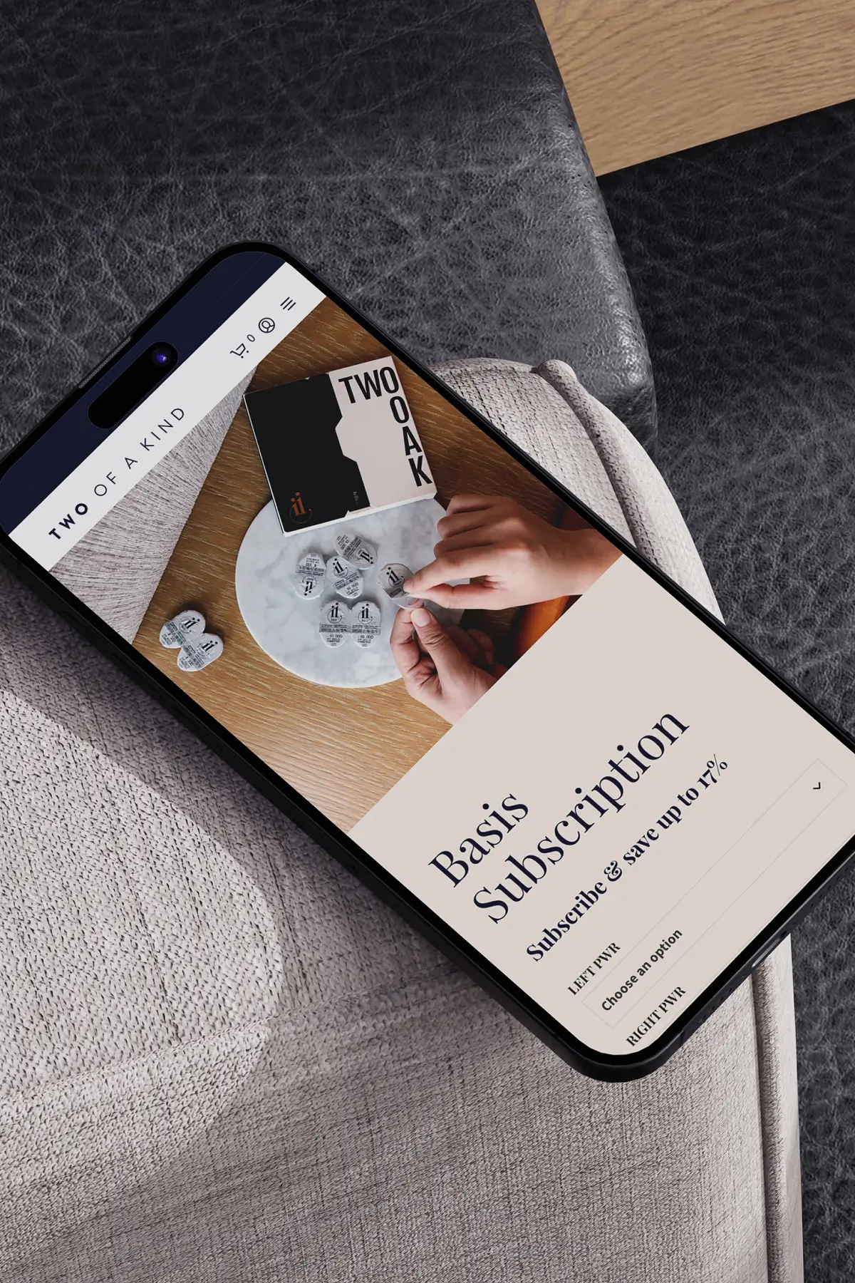
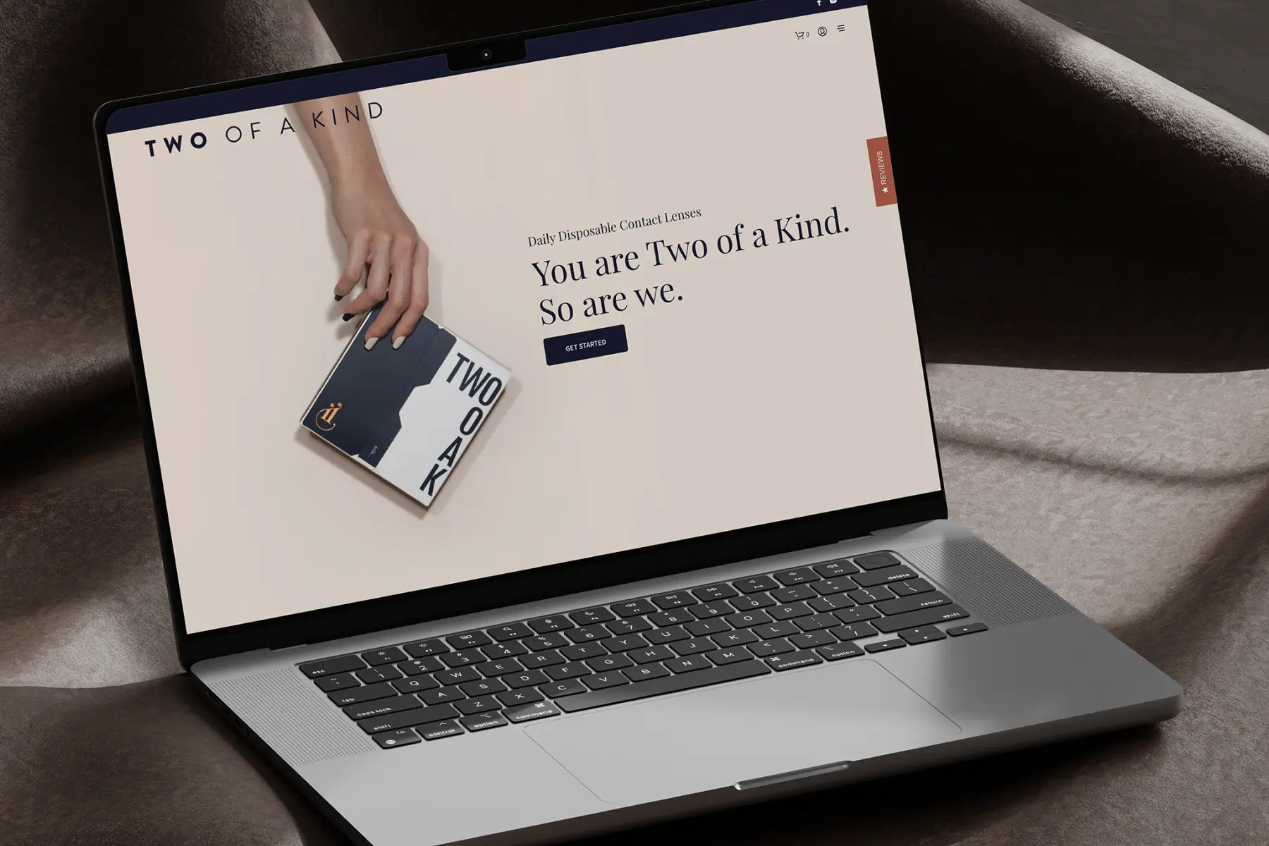
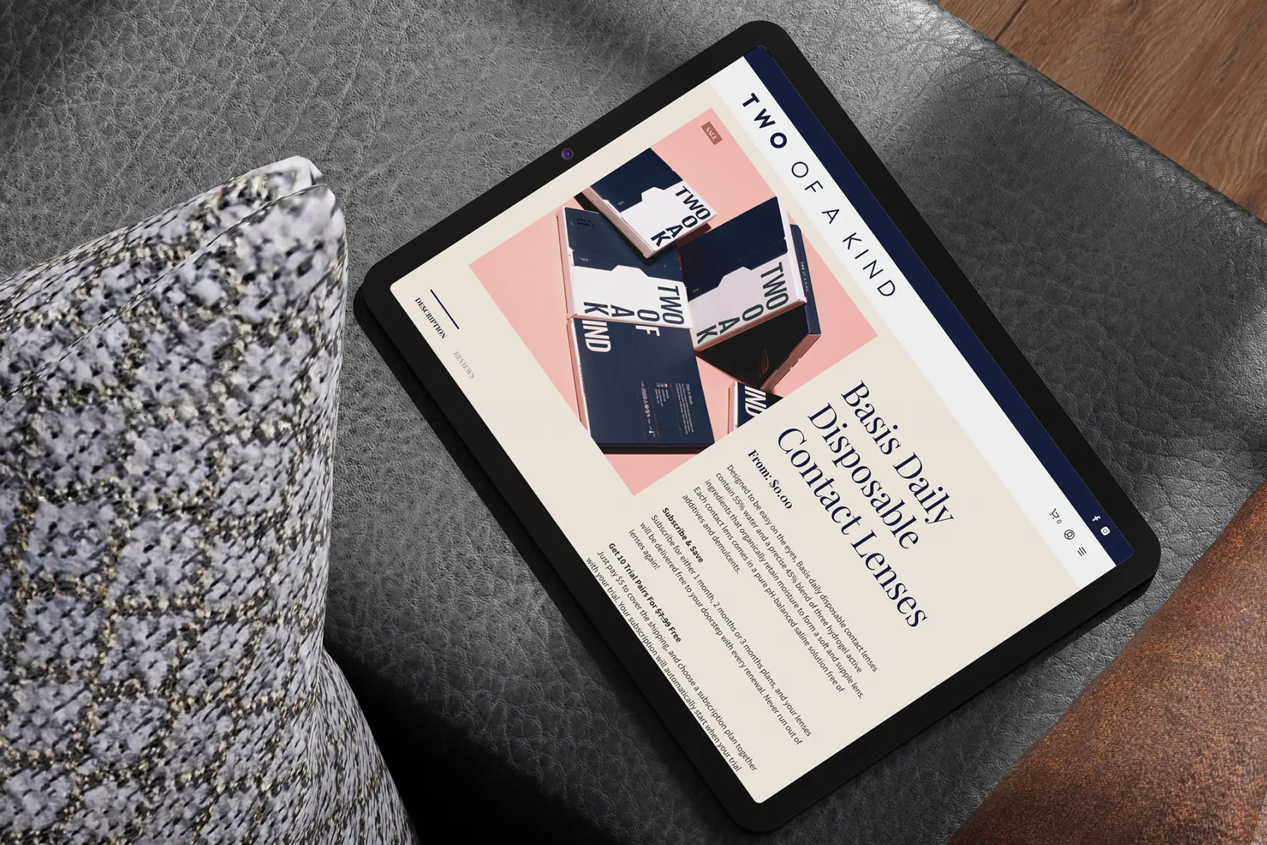
The main goal of this project was to design and develop a seamless brand and intuitive e-commerce solution to enable TWOOAK to reach out to its potential customers, for customers to sign up for subscriptions, and to retain existing customers.

Our focus was to create a brand that is visually engaging with great aesthetics on all touch points. By leveraging on existing commerce frameworks, we are also able to offer a cost efficient solution while integrating a customised solution based on client’s business model (guests have to attend a consultation before being able to purchase).

Project Type —

Corporate Identity

Packaging Design

Website Design

Website Development

E-Commerce

Results —

1817.5% ↑

above the average monthly sessions

1800% ↑

above the average monthly new user acquisition

5.45% ↓

below the average monthly bounce rate

*Results are benchmarked with SG eyewear websites on Google Analytics after 6 months of operation

Fig. 1. Business Handouts

Strong & Consistent Branding from Physical to Digital

Two of a Kind was created with the intention of realising a strong brand recognition amongst the users. Initial design discussions constantly shifts around the idea of creating a brand that would bring value to the users and that the users would love to be associated with, a brand that they would constantly carry around and show off physically or online.

We designed and balanced the brand to created an identity that would provide a cohesive experience for the customers—from online social media posts and website, all the way to the receiving of their package in their mailboxes.

Fig. 1.1. Copper Foil Stamped Logo on Packaging

Fig. 1.2. Construction and Fine-tuning of Selected Logo

Simplifying the Process for Customers

Due to the nature of the business, we focused on simplifying the customer’s journey into 3 steps: Sign Up (the show of interest by booking for an appointment online), Get Fitted (a 15 minutes consultation with a qualified optometrist), and Buy / Subscribe (linking of payment details onto the digital platform, and have prescription delivered to customer’s doorstep).

We have also integrated the backend to other platforms in order to optimise business and customer management for the company.

Fig. 2. UI/UX Designed Online Journey

Fig. 2.1 No Fluff—Clear-cut and Easy Instructions

“Two years of research, interviewing experts and testing products ourselves. We ended up partnering with companies that care as much as we do, and worked closely with them.”

—Darryn Tan, Co-founder, Two of a Kind

Fig. 3. Primary, Secondary and Tertiary Packaging

Encouraging Retention through Product Experiences

Our brand recognition effort does not stop once visitors are converted into actual paying users online. In order for the company to retain users and encourage recurring sales via subscription, we knew that the packaging has to be well-received and “instagrammable”.

These thought processes and objectives are then boiled down and translated onto the final packaging design for the brand. Sleek copper-foiled logo stamp accompanied by easy rip and tear perforation sees the packaging quickly gaining affection and shoutouts from customers on social media platforms.

Fig. 3.1. Alternate Design for Secondary Packaging

Fig. 3.2. Exploration of Primary Packaging Design

flag&mountains is a creative digital agency, at the intersection of design, technology & business. Since 2012, we’ve had the honour to work with hundreds of companies and businesses.

Read more about us here →

Have a Project in Mind?

Let’s Chat over Coffee.